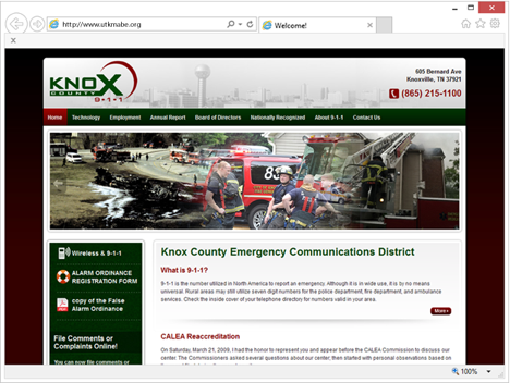
Revamping your mobile website to an all-new mobile responsive website wouldn’t be a bad idea, especially if you are hoping for a better return on investment when it comes to your advertising dollars.
What’s the Difference?
If you follow the Knoxweb Blog, you will know the difference between a mobile website and a mobile responsive website. In the simplest terms, a mobile responsive website literally responds to whatever device is being used and will adapt to a Smartphone, tablet, PC, Smartwatch or a laptop. A mobile website is restricted and can sometimes be cumbersome for the user.
Google made mobile websites mandatory back in April of 2015, well, sort of. According to Knoxweb, Google said that it would penalize businesses and organizations who did not comply as more users were accessing mobile devices to conduct searches. PC’s and laptops were taking a back seat and that meant giving companies with mobile responsive websites a leg up on the competition.
Fast forward to 2016 and more businesses are beginning to feel the sting of Google’s announcement. What some thought to be a mere scare tactic turned out to be a reality. Businesses and organizations that were not mobile friendly found it difficult, if not impossible to locate their website on Google, Bing or the other search engines.
According to Knoxweb, a mobile responsive website is mandatory, but what should it look like? What is the best way to boost your ratings and your bottom line?
One of the biggest issues for users when it comes to a mobile responsive website is similarity. However, as Knoxweb explains, you can’t just blame the design. The theme market is huge with companies wanting website designs that are easy to use and update. WordPress is a popular template responsive website design option that is simple and easy to use.
With an abundance of UI Patterned websites that consume the World Wide Web it’s changed the way people use the internet. UI design patterns mean little innovation with the overall site. There is still a checkout, if it is a shopping site and should still be user friendly if it is a login website. UI Patterns guide the user through a fast, easy, and smooth experience.
Below are a few patterns that you are probably familiar with:
The Hamburger-Although some are quick to criticize the patterns use, there is no doubt that the hamburger menu is widespread making it easily functionable and recognizable.
Registration-There is usually a button or a form that allows the user to sign in with a social media account, an existing account holder or a sign up button. Multi-step wizards are also popular as they reduce friction chunking out the fields while making the whole process fast and smooth.
Long Scroll-Putting all of the important website elements above is a myth. Most people who access the net on a mobile device are used to long scrolls. Sites that want to encourage users with storytelling, can still act like a multi page website by breaking down the scroll into clearer sections.
Card Layouts-Pinterest is the pioneer of the card layout and now you will see the pattern everywhere with snippets of info that represents a unified concept. Because they are rectangular, it is easy to arrange depending on what device is being used.
Hero Images-Humans react to visuals. Pictures and videos rate higher when it comes to click though rate. HD hero images grab user’s attention and because of advanced data compression and bandwidth, your users won’t have to deal with slow load times, which is one of the quickest ways to lose a potential sale. According to Knoxweb, a common hero image layout is above the scroll.
In the next blog, Knoxweb will share more mobile responsive website design trends that you may want to discuss when you schedule a meeting with the gurus from Knoxweb. Call or click today.


